Case study · Beauty
A press-on nail brand
with a magazine's eye.
Nail Daze makes press-on nail sets designed like editorial objects: marbled, chromed, hand-finished. KRAM built the brand's visual world around that idea, from a wordmark that behaves like a fashion masthead to the feed that carries it.
- Brand identity
- Logo animation
- Art direction
- Social content
The mark, and how it arrives.
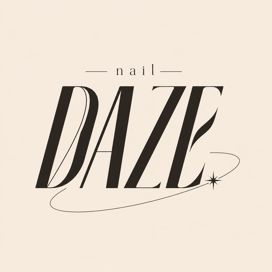
Nail Daze had a name that wanted to be set in type, not drawn as a picture. The wordmark takes a high-contrast display serif, the kind that runs across a fashion masthead, and lets the final letter fall into a swash that circles back to a single star.
In motion it draws itself on, catches a chrome sheen, and settles. It is the first thing a customer sees on a reel and the last thing they see on a box.
The ground it sits on
Bone
#F7EBDD
Ink
#171310
The feed, art-directed as one piece
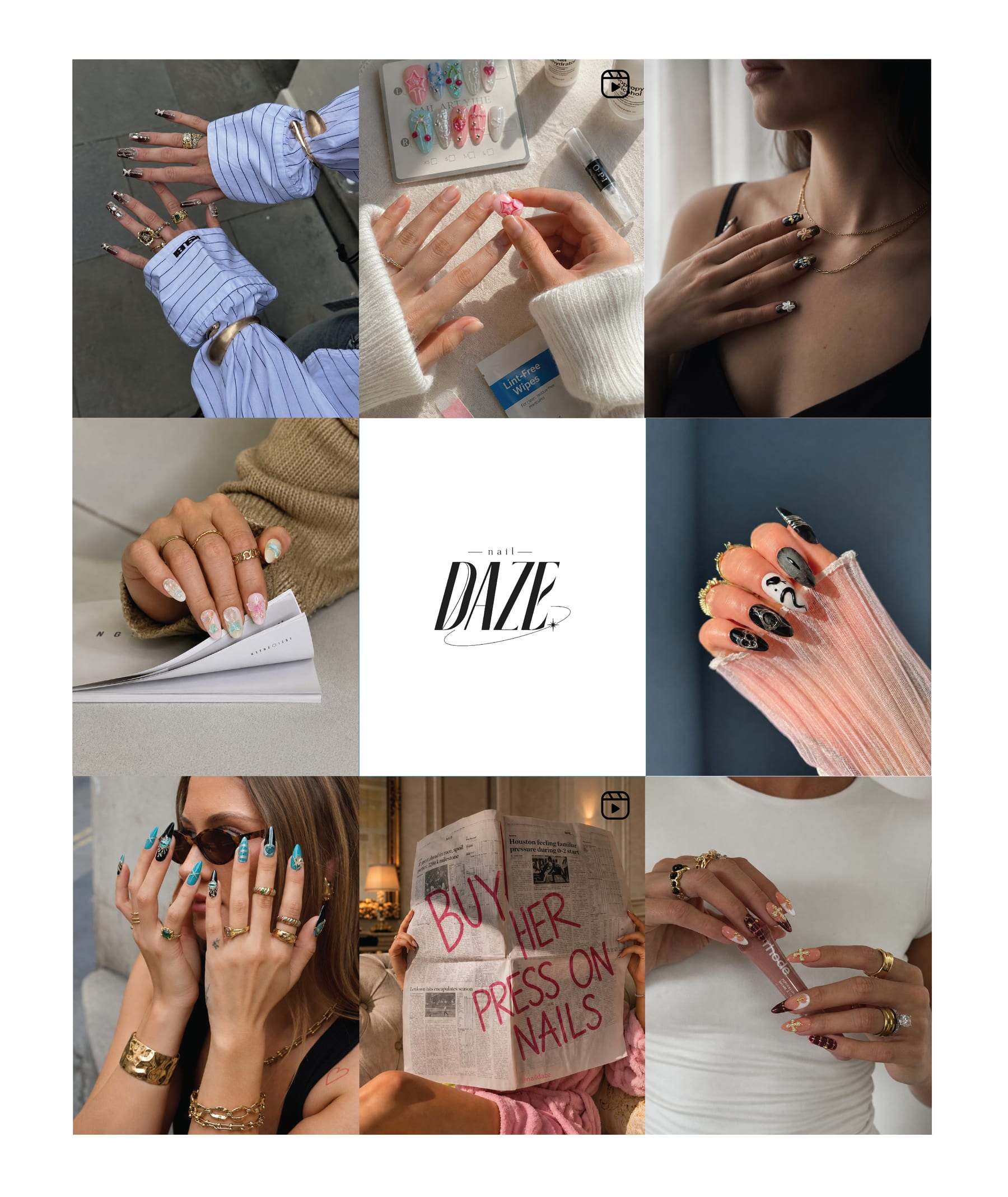
On a grid, a post stops being a post. Nine tiles alternate hand, product, and editorial, with the mark holding the centre.
The work in motion
Campaign film
Press-on nails, sold like a headline.
Product drop
The set, shown the way a customer opens it.
Street style
The nails as an outfit detail, not a product shot.
Your brand could be the next case study.
Tell us what you're building. We'll show you what it could look like.
Common questions
Questions about Nail Daze
What did KRAM Creative do for Nail Daze?
KRAM Creative built the brand identity, logo animation, art direction and social content. The wordmark uses a high-contrast display serif set like a fashion masthead, and the Instagram feed was art-directed as a single nine-tile composition rather than as separate posts.
What is Nail Daze?
Nail Daze makes press-on nail sets designed like editorial objects: marbled, chromed and hand-finished.
Does KRAM Creative design animated logos?
Yes. The Nail Daze wordmark was built to move: it draws itself on, catches a chrome sheen, and settles. It is the first thing a customer sees on a reel and the last thing they see on a box.